EPIC Events and Marketing
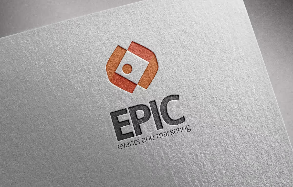
EPIC was a new business created by Richard Welsh, providing origination, facilitation and marketing expertise to sporting organisations, businesses, athletes and major events. EPIC required a logo that matched the name and the personality behind the business, but also encapsulated the sense of professionalism and creativity that the EPIC team also provide across their variety of services. The logo also had to incorporate the initial colours fleshed out by Richard, including the orange and the dark grey.
View live project →The new EPIC logo incorporates the requirements set out by the EPIC team. The orange and dark grey colours, already established by Richard as the colour palette for EPIC, form the basis for the palette and represent the bold and exciting nature of the business.
The coming together of client and the EPIC team is what defines and influences the logo, but differentiated in that what EPIC provides is different to similar businesses in the landscape - they create EPIC EVENTS and MARKETING that “goes beyond the usual or ordinary…” (def: EPIC).
The EPIC logo has enabled the continually emerging business to have an image to both promote and refer back too, and has seen coverage across numerous small to large scale events including the Tasmanian Christmas Carnivals series, Devonport triathlon and other events across the nation.
Book a chat to discuss your project. We'll listen, sketch a Game Plan, and tell you if we're the right fit - no pressure, no pitch deck.